AD Sound
Early to mid June, Jetway Amsterdam approached me about a rebrand they were doing. AD Sound, a DJ label in Amsterdam that wanted to renew their brand for their 20th anniversary, I was to make their brand reveal video.
At its core, the new branding was pretty minimalistic, they wanted to spotlight their artists as much as possible, and take a backseat whilst still providing a solid basis. The old AD logomark was reworked into the new version, one that is just as much two shapes as it is the letters "AD", a small set of contrasting colors were chosen, and a tightly tracked and spaced Avenir typeface would cover 99% of the typography in clean & simple layouts.
All that said, this was their brand reveal, and for once it was more so about the aspects of their brand rather than the artists, so I was given all the more freedom to explore different styles, movements and layouts for the video.
Approach
In my eyes the logo rework was clearly the first piece of the puzzle in the rest of the rebrand, so I wanted to showcase the advantages of such a minimal design, and highlight how the logo was reworked, not thrown out and replaced. Together with Jetway I landed on a set of boards that was driven by the morphing of the old logo into the new, in tandem with shots that showcase the alternate style.
To emphasize how a minimalistic design like this can form a backbone for wild styles and aesthetics (and to just look kinda cool) I created multiple styles for the logo to be applied to the relatively simple movements of the morph. In contrast, I wanted the alternate style to not do too much, show off the range of possibilities without getting boring. A little AE 3D and a classic motif of drawing on lines was all that's necessary to help out with pacing the video.
Together, that covers the logo reveal and leaves room to sprinkle in some shots that showcase AD Sound's brand as a whole, things like artist lineup, auxiliary branding assets, and generally bits and pieces of the brand guideline that I was working off of myself. We cut those shots inbetween the logo reveal shots to break things up a little and off we went.
Execution & challenges
Most of the movements themselves were fairly simple, the challenge was more-so in handling the workload that came with creating all these different styles. Call it a lack of experience, but imagining distinctly different styles and recreating them in After Effects afterwards is a process of experimentation for me, a rather time investment heavy one at that. Luckily for me, Jetway trusted me to bring it home in the end when I presented little more than a set of proof of concepts on our first check-in.
What follows below is a little breakdown of how my two favorite shots were created, although admittedly not particularly complex, they function as a good example of the time investment heavy experimentation I was talking about, I don't typically work with tons of effect stacking, blending modes and the likes. It's the process of experimentation and discarding failures that really ate up most of my time, even if they are relatively simple in the end
What follows below is a little breakdown of how my two favorite shots were created, although admittedly not particularly complex, they function as a good example of the time investment heavy experimentation I was talking about, I don't typically work with tons of effect stacking, blending modes and the likes. It's the process of experimentation and discarding failures that really ate up most of my time, even if they are relatively simple in the end
Getting relatively comfortable, cranking shots out quickly since all the hard work was ready to go and just needed assembly, I was slightly blindsided by a hiccup when creating the grid shots that resulted in a lot of extra work.
For a change of pace, In the coming section, I thought it'd be fun to dive into specifics, I will try to present the problem and my solution, partially to give potential outsiders to the world of motion graphics a peek behind the curtains, but secretly more-so in hopes someone will read this and message me about a much simpler solution. Feel free to skip or skim this if you're not particularly interested, I get pretty nitty gritty with it and start at the basics. The case study resumes at the paragraph "Retrospective", no hard feelings, I promise.
For a change of pace, In the coming section, I thought it'd be fun to dive into specifics, I will try to present the problem and my solution, partially to give potential outsiders to the world of motion graphics a peek behind the curtains, but secretly more-so in hopes someone will read this and message me about a much simpler solution. Feel free to skip or skim this if you're not particularly interested, I get pretty nitty gritty with it and start at the basics. The case study resumes at the paragraph "Retrospective", no hard feelings, I promise.
A little background
Starting at the absolute basics, this is a rectangle shape layer in After Effects. It's what I'll be "matting" my desired image on, meaning my image will only display where the rectangle is currently visible, in this case, it will be my frame.
This shape layer has plenty of different controls, but I'll be focusing on its scale controls. It has an X and a Y scale, which -unsurprisingly- scale the square in the horizontal and vertical dimensions. As you can see in the GIF on the right, it does so from the anchor point, the crosshair in the middle or at its edges.
This shape layer has plenty of different controls, but I'll be focusing on its scale controls. It has an X and a Y scale, which -unsurprisingly- scale the square in the horizontal and vertical dimensions. As you can see in the GIF on the right, it does so from the anchor point, the crosshair in the middle or at its edges.
Normally, to ensure the image I want to display is constantly in the same position as the rectangle its matting on, I would "parent" them to the rectangle, essentially tying the position of my image, to the position of the rectangle together at its anchor point. When the parent moves 100 pixels to the left, the child stays with it.
Fig. A (hover)


The problem
The problem arises with the movement I'm looking for, as you can see on the left in figure b showcasing some isolated movement that can be found in the grid shot, I need to be able to scale all sides of the rectangle simultaneously, and disproportionally.
Simplified, using the scale control from an anchor point I can scale only 2 sides out of 4 simultaneously. Theoretically, I could place the anchor point in a corner, use the scaling control to tackle scaling to 2 out of 4 sides, and use the position controls in tandem with scaling back down to create the illusion that I'm scaling 4 sides simultaneously and disproportionally. In my experience though, it's near impossible or at least horribly time consuming and 10x more frustrating to achieve precision with this method, not something I was willing to give up on given the rigid nature of grids.
Simplified, using the scale control from an anchor point I can scale only 2 sides out of 4 simultaneously. Theoretically, I could place the anchor point in a corner, use the scaling control to tackle scaling to 2 out of 4 sides, and use the position controls in tandem with scaling back down to create the illusion that I'm scaling 4 sides simultaneously and disproportionally. In my experience though, it's near impossible or at least horribly time consuming and 10x more frustrating to achieve precision with this method, not something I was willing to give up on given the rigid nature of grids.
Fig. B (hover)


The solution
Gaining control of all 4 sides of a rectangle by itself is pretty easy, nowadays After Effects comes with a script that allows you to tie the points on a path to "null objects", new layers with no contents, basically existing only to give you an independent set of controls. All I need to do is turn my rectangle into a path, tie the points of that path -in this case the corners- to null objects, and now I can individually control those corners.
It's never quite that easy though, having gained control over all sides of the rectangle, a new problem arises: this rectangle is no longer a shape layer, it's been converted to a path shape layer, in the shape of a rectangle. An annoyingly minor detail that has cost me the ability to simply parent my image to the rectangle and call it a day. You might've spotted it in figure b, but the anchor point has gone all out of whack and is now nowhere near accurate. Once again, theoretically I could adjust the position of my image matting on my rectangle manually, but it would be incredibly time consuming, imperfect, and any shortcuts would stick out like a sore thumb. It seems like some "expressions" -essentially scripting for After Effects- are in order.
Fig. C (hover)


In some cases, you could find the center of a rectangle despite complicating factors by calling on the "sourceRectAtTime()" function. I'm no master of expressions, but as far as I know, essentially you're asking After Effects to detect the furtherst edges of a rectangle and work with the information it returns. However, the minor detail from before pops up again, my rectangle is no longer a rectangle in the eyes of After Effects, it's a path (shaped like a rectangle)
Luckily for me, I have four null objects with position properties, and since it's a rectangular shape, even my limited math skills can figure out where the middle of those four layers is. I can simply take the X coordinate of one null on the left and one null on the right, add those values together, and half that, same goes for the Y coordinate by taking a top and bottom null. That leaves me with the X and Y coordinates that my image need to always be in the center of my rectangle, and wraps this thing up.
Luckily for me, I have four null objects with position properties, and since it's a rectangular shape, even my limited math skills can figure out where the middle of those four layers is. I can simply take the X coordinate of one null on the left and one null on the right, add those values together, and half that, same goes for the Y coordinate by taking a top and bottom null. That leaves me with the X and Y coordinates that my image need to always be in the center of my rectangle, and wraps this thing up.
Fig. D
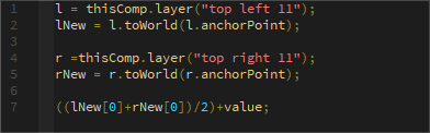
No real need to pay any mind to the first 4 lines, they specify what layers I want to look at, and to take their true position, not the relative one. The "meat" of the expression is in the final line, and is very simple.
Retrospective
Of course there's always things I'd like to do differently next time, repeat any project and you'd never get the same result (hopefully anyway), but realistically, there's no techniques, movements or designs that are particularly tough in this project, yet I still struggled. Looking back at it, even though I think I would do well to be more conscious of potential pitfalls in the form of time-sinks, iterations, and a degree of uncertainty that comes with experimentation, I don't think this struggle could be entirely avoided.
At the end of the day I learned a lot about how I could and should improve the way I work, lessons that I think can only really come through experience. I'm a sucker for a good productivity hack or system optimization, but there's no shortcut to simply getting your miles in, and even though I am now sick of seeing this video, I'm glad I did.
At the end of the day I learned a lot about how I could and should improve the way I work, lessons that I think can only really come through experience. I'm a sucker for a good productivity hack or system optimization, but there's no shortcut to simply getting your miles in, and even though I am now sick of seeing this video, I'm glad I did.


